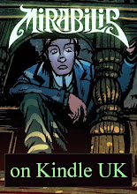
 In very early versions of the comic, we started off with Jack in a more modern style of army uniform. As you can see (left), that really wasn’t working. Possibly it would have been more historically accurate in a story that nominally begins in 1901 but, as Emerson said, "a foolish consistency is the hobgoblin of little minds." The flamboyant hussar’s uniform that we eventually settled on is much more in keeping with Jack's romantic streak.
 The very first pages of Mirabilis were a prototype pilot episode that Leo and I did (Nikos wasn’t on board yet) for The DFC’s dummy issue. The experience was… eye-opening. It wasn’t just the clothing that was wrong. Jack and Estelle needed to be way more attractive. So we opted to give Estelle a look that modern readers would find more relatable. She cuts her own hair – that was part of the character description from day one – and she does so with garden shears, so that gave us a legitimate excuse to avoid that off-putting Princess Leia hairstyle. Tom Fickling, son of David Fickling (the “DF” in DFC) put it succinctly: “Give her fit bird hair.”
Jack also looked rather too young and unathletic (even podgy) in the dummy episode. Partly that was to get the gig, because we had to please David Fickling and his initial brief was a comic for 7-10 year olds. At 10 I was reading Daredevil and Spider-Man, but that’s not how publishers see kids today. In fact the age of the strip was something that we and the Mezolith creators had to fight for all the time the The DFC was running.
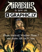
 Anyway, when we knew we had a green light for the series, Martin and Leo got to work on giving the characters a more dashing look. Martin even got out a camera and started snapping some action poses to give the comic panels a bit of vim. The dashing uniform he came up with shows off Jack’s heroic figure and incidentally shows that he is in the same regiment in which Coleridge briefly enlisted: the 15th (Elliott's) Royal Dragoons.His version of Estelle (bottom of this post) is a lot more engaging than the original "dowdy granny" look.
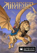
The striking poster image that Leo drew of Jack (top of this post) makes a great piece of concept art, although I don't think it will end up being an actual scene from the story because the giant lion is a touch too Narnia. But that doesn’t mean that he won’t be astride something with wings in the Spring book.
All this development work takes time, and even though it may seem blindingly obvious that the finished version is better, it isn't always that clear when you're groping your way through the maze of creative choices. Good creative development is a matter of trying things out and learning from your mistakes.
Apart from the character’s appearance, there are several storytelling tools that the writer can apply to make readers care about a character:
- being resourceful
- being brave
- being clever (not the same as merely resourceful)
- doing a good deed ("save the cat")
- being unfairly treated (“kill the cat”)
- standing up against unfairness or injustice
- doing something we can relate to - especially if funny, but can be as simple as cleaning teeth, having breakfast, if made into an interesting bit of business
- being in a relationship we can connect with - even two apparently despicable characters start to become relatable if we see a friendship forming between them
- in a situation we recognize - stuck in the rain, needing a pee, late for a meeting, etc
- being interesting - this is how an audaciously badly-behaved, rude or even evil character can be made very compelling: what will they do next?


No comments:
Post a Comment